MappUQ
UX Research · iOS Prototype
Client:
Universidad del Quindío
Role:
UX/UI Designer & iOS Developer
Year:
2017

iOS indoor location app using iBeacon technology, designed and tested on a real university campus.
Graduation Project — Systems & Software Engineer
The Problem
How do you find your way in a place you don't know?
The university campus was too large to navigate without guidance, and signage was lacking. New students arrived late to class, visitors got lost during events, and stopping whoever was walking by became the default way to find anything.
So, what is needed to position someone accurately indoors?
The question wasn't just technical — it was about finding a technology accurate, reliable, and coherent with the physical environment of a real campus.
Research
The answer had to be found in two places: the technology and the people.
I knew the problem. I didn't know if it was solvable. So before talking to a single user, Technology validation came before any design decision.
GPS was the obvious starting point:
Signal loses precision indoors — unusable for room-level navigation.
NFC was the next candidate:
Interaction distance is too short — you'd need to physically touch a sensor to know where you are. That's not navigation, that's a scavenger hunt.
Now what?
The search for an alternative led somewhere unexpected
iBeacon:
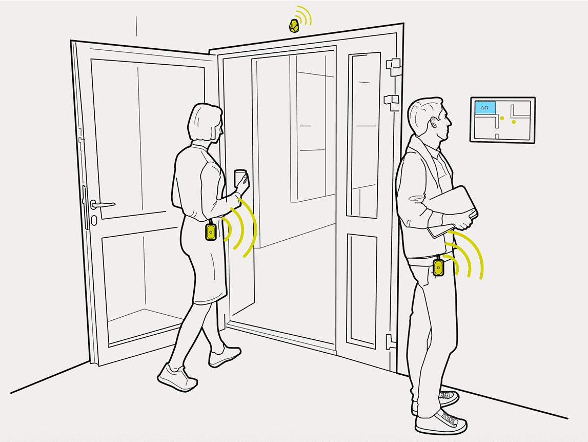
iBeacon Is a protocol developed by Apple that uses Bluetooth Low Energy to broadcast a signal from a small physical device "a beacon" installed in a fixed location.
Any compatible device within range detects that signal and calculates its approximate position based on signal strength.


That was exactly what the problem needed
No internet required
Reliable positioning up to 100 meters
Deployable across the campus without modifying existing infrastructure
One known constraint: Bluetooth must be active. A known trade-off, accepted from the start

Key Decisions
Every decision had to work in the real world, not just in theory.
Estimote beacons with iOS SDK and Swift 4
iBeacon defined the protocol. Estimote made it buildable — the only provider in 2017 with mature documentation and full Swift compatibility.
Don't reinvent navigation. Use what people already know
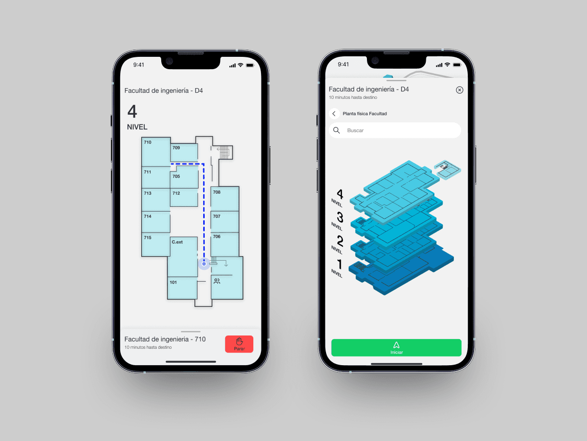
An unfamiliar interface on top of an unfamiliar place creates two problems instead of solving one. Google Maps provides the mental model: search, select, navigate.
Navigation breaks down at two scales. The solution had to work at both
A color-coded campus map handles outdoor orientation. A floor-level plan handles room-level precision.
A technical requirement becomes the first design decision
Bluetooth has to be on before the app can do anything. Surfacing that requirement first — with a direct path to settings — turns a technical constraint into a UX moment, not an error screen.
More notifications isn't better. Fewer is
Every unnecessary notification is a reason to ignore the next one. Only entry notifications — exit events are ignored.
Solution


Outcome
4.8 out of 5.0
Thesis presentation score before the evaluation committee.
125 students. 97% acceptance
25 completed a full navigation walkthrough on campus. 100 attended a demo and survey validating usability and technology viability.
The university wanted to implement it
Post-graduation conversations to deploy the app campus-wide were initiated. Intellectual property rights held by the institution made an agreement impossible to close — not a failure of the product, but of the terms around it.
Testing revealed something beyond navigation
Students immediately proposed extensions: security checkpoints, visitor control, event-based activation. The technology was intuitive enough to inspire new use cases on first contact.
What I'd do differently
Run a dedicated research phase to map the full problem space. The scenarios students identified during testing weren't edge cases. They were the next product.